For those
who work with Paintshop Pro: I've never worked
with that program so I have no clue if things
are vastly or minorly different from photoshop.
However, it certainly doesn't hurt to read through
the tutorial just in case something may apply.
This is a
quick tutorial I whipped up a while ago for those
who wanted to learn how to make … well…
folds in Photoshop. I've since redid this in Photoshop
7.0 so the screenshots have changed slightly and
they are larger than the old PDF version so now
you can read things better (YAY). Okay, let's
get started…
Since I'm
not here to teach you how to use Photoshop from
start to finish, I'm going to assume you have
some knowledge of the tools and where they are
and how they work. If not, there are a plethora
of tutorials out there you can look into and read
up on. Also, if your serious about wanting to
learn different effects and such, go look through
the Photoshop Bible in a book store or check it
out via library. It's 200+ pages of yummy texture
effect making goodness.
Now, let me
give a brief synopsis of what this tut will cover:
-Fold making using Lines and Gaussian Blur
-Fold making using Freehand Style and Motion Blur
-Fold making using Burning and Dodging
KBSC - Key
Board Short Cut
Lines
and Gaussian Blur
Ok, now, first and foremost we need to launch
Photoshop and get a nice new pristine white file
started. I typically choose my files to be 1024x1024
pixels (or 512x1024 which ever I need since model
texture sizes vary) because working larger allows
me to get clearer details in the image. When you
later shrink the file, you do loose some of that
detail, but you'd be surprised how much it can
retain. So 1024x1024, 72 DPI, and on the RGB scale.
Make sure you've got RGB instead of CMYK. I've
noticed that some filters are not available to
you in CMYK mode. Oh and in case you don't know
the difference between the two, RGB (red, green,
blue) is used mostly for web graphics. CMYK (cyan,
magenta, yellow, black) is used in the printing
process like screen printing or poster printing.
Now with my
new file I choose a color I want. This time around
I want a lovely mauve pinky color, so I click
on the paint squares and choose the color from
the color picker. Next I choose the paint bucket
(KBSC - G) in the tool box. Next I go to my layers
palette, then click on the arrow on the upper
right side and make a new layer. I can't stress
enough how important it is to make layers for
your work. That way if something goes seriously
wrong, you can just delete the offending layer,
and start a new one rather than messing up your
entire image and having to start over!
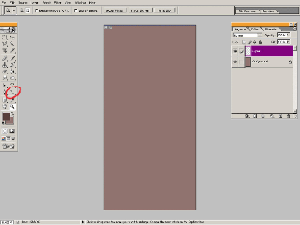
On a new layer, select the line tool or hit the
U key (if it is not showing on the tool menu,
hit Shift U to cycle through the various tools
in that slot. Or, just left click and hold on
the rectangle menu to bring up a list of the other
tools in that pull down) and chose what color
you want your first fold crease to look like.
I typically make the color darker than normal,
though you could do just the opposite and make
it a highlight instead. Make the width however
large or small you want in the upper info bar
(I chose two varying weights, the larger line
being on a separate level), then, holding down
the shift key to constrain the line angle, draw
a vertical line. Repeat this however many times
you wish, making sure you at least have some space
between the lines.
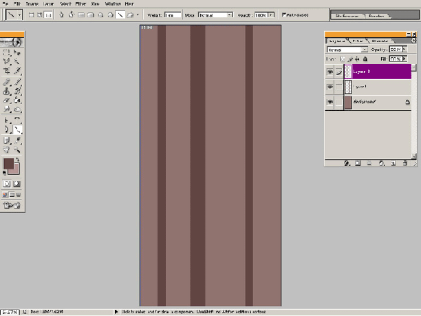
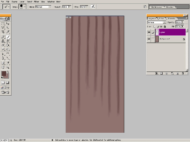
Now go up
to the top menu and go to Filter>Blur>Gaussian
Blur. This is the window where you can adjust
how much of a blur effect you want on your lines.
For heavier line weights, you'll need to adjust
the radius to a higher pixel count. Basically
this is taking X amount of pixels, and effectively
feathering it out from the center point of the
image. You can either preview this on the actual
image or in the little preview box too. For my
little demo, I chose a radius of 22 pixels for
the larger line and 12 pixels for the smaller
lines. You still want to be able to see some form
of color differentiation from the background color
and still make the lines look nice and soft.
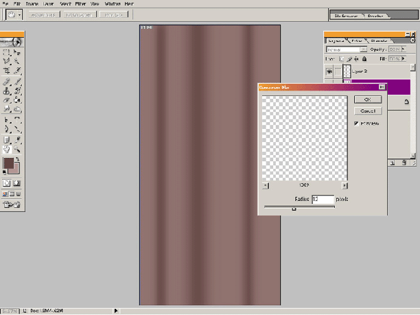
Click ok.
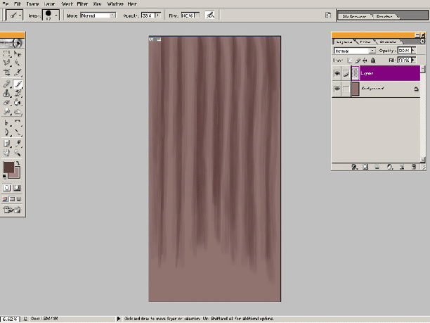
Now, after making a new layer, go back to the
line tool again, select another color that's darker
from the first color you used, then adjust the
line weight again so it's smaller. The reason
you want to make a smaller line is because when
you use gaussian blur again, you don't want to
cover over the last blur line you created. Holding
shift again, draw another vertical line, then
center it over the previous blur.
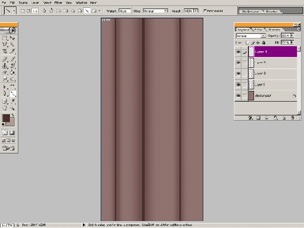
Go back to
Filter>Blur>Gaussian Blur again. If you
chose Filter>Gaussian blur from the menu, what
will happen is photoshop will apply the last radius
amount you implemented. Since you're dealing with
a smaller line weight, this will effectively make
your smaller line blur so much you won't see it.
Now choose a gaussian blur that blends the smaller
lines softly without causing them to disappear.
You can see how blending is starting to give the
appearance of a fold.
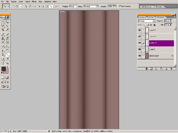
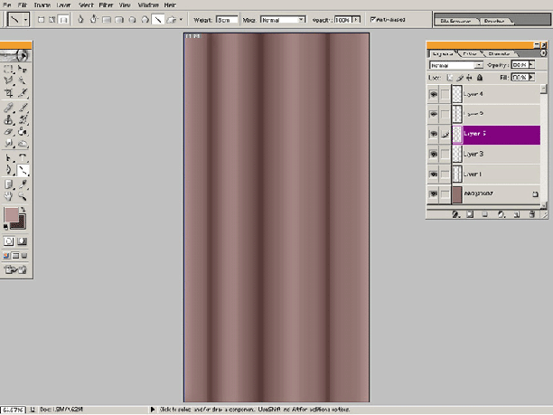
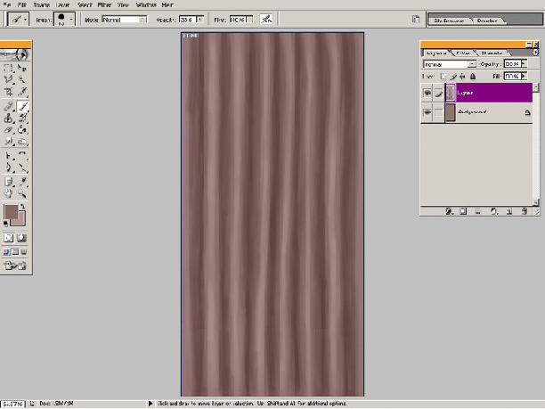
You can repeat
this as many times as you want to get the desired
effect. I find gaussian blur really nice for also
doing shadows for under layered clothing too.
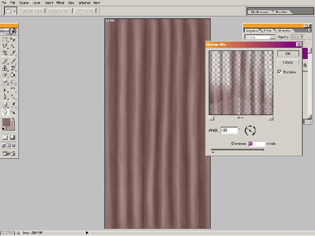
Freehand
Style and Motion Blur
This is the technique I use to make folds have
a more loose, natural flow to them. After getting
your base color on your first layer, start on
a new layer, then choose your Brush tool from
the tool box. Now choose your next color (for
your fold shadow or highlight). I typically turn
the opacity of my brush -way- down because I like
to use a layering effect to get the different
tonal changes. But it's up to you really if you
want more opacity. Just for the sake of the tutorial,
I set my brush down to 33%.
From here
I start to free hand and just draw in random lines
and drapery. The nice thing about having the brush
set on a low setting, is you can go back and layer
the colors and try to smooth the edge more. Notice
it still looks really choppy but later on this
will be fixed.
Once I'm happy
with how the final folds look, I head to Filter>Blur>Motion
Blur. I could use gaussian, but with motion blur,
I tend to like the slight texture I get using
this filter. Makes the cloth look a wee gritty
which seems to be a trend with Morrowind clothing.
So with my Motion Filter window open, I pick what
distance I want as well as the direction I want
the motion to be flowing. You can click and drag
the handle bars in the circle to change this direction,
or punch in what angle you want. Now I don't necessarily
want my fabric to look uber smooth, so I chose
to have the distance set to 10 pixels.
Click ok and
let the filter be applied. From here I pretty
much have some fun and go crazy with implementing
other filters. There are times I'll just sit and
experiment (using copy's of my original layer)
and make a skirt look really textured.
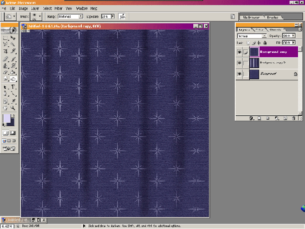
Dodge
and Burn
Dodging and burning are the commonly used tools
I use to make folds for fabric swatches I sometimes
use in my work. Since these have a texture and
pattern on them already, I want to retain all
that detail and if I use the airbrush tool, then
I'm only going to cover over the textures. Since
I want to keep all the texture underneath, I use
dodging and burning as a means to achieve this.
In case you are unfamiliar with what this is,
dodging and burning are two photography terms.
Dodging is holding back the light in which you
expose an image to, thus making it lighter. Burning
is the opposite where you allow more light to
hit an area and make it darker.
Now let's
take a look at the sample swatch I've made:
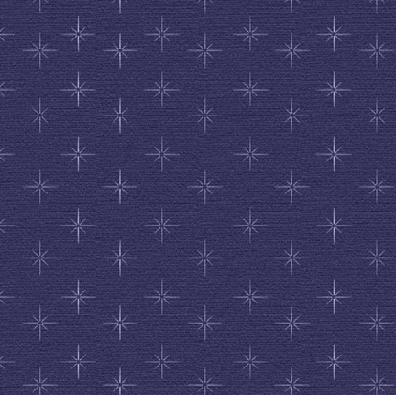
Pretty spiffy.
So now I go
up to my tool bar and select my burn tool. I always
work dark to light, something you don't necessarily
have to do, it's just a preference really. Up
in the info bar, I turn down the exposure to about
21 so I have nice soft strokes. Now I start exposing
some of the areas where I want my darker folds
to be.
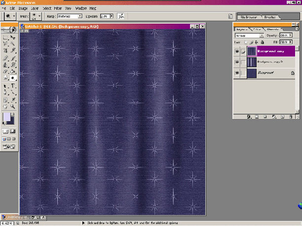
Now dodging
can be a bit tricky. The reason is that if your
not careful, your texture can become so overly
bright it washes out the pattern below it, making
the texture look unnatural. I use dodging -very-
sparingly. Well, technically I use both pretty
sparingly as I don't want things to become over
exposed.
This is an
example of a hideous over exposure for both dodge
and burn.
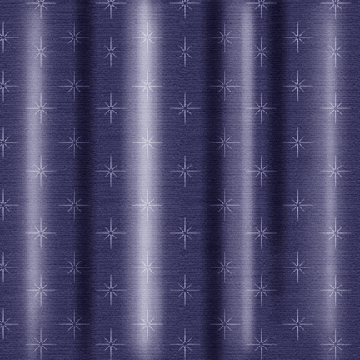
Yikes!
This concludes
the actual tutorial part, however I did want to
dish a little something extra out for you peeps.
Sils Free Advice of the Day:
It takes time before you can get folds to look
convincing. But I can tell you some hints on how
to improve. These are...
*drum roll*
3) Study - AHH! It's the 'S' word! I'm certain
some people are thinking, "Bah! Study!"
but trust me, but the more you know about how
drapery and folds work and what types there are,
the easier it will be for you to draw them. It's
the same way with figure drawing: sure you can
just draw the figure as you see it, but unless
you understand how muscle, tendon, bone, and ligaments
work, you're skills will improve slowly. Now a
really good book, if your interested that is,
is Burne Hogarth's Dynamic Wrinkles
and Drapery. It covers (eh… no pun intended)
all the folds you could need to know!
2) Observing
in life - Ho hum still lifes actually help hone
your skills. If your having trouble, take a piece
of fabric (like a drape or dress or Aunt Emma's
satin robe) and set it up the way you want the
folds to fall. Then use that as your template
for your work. Another good thing to have is some
digital photos of various folds so you can just
pull them up and either use them as reference
or to use straight on your piece. The last thing
to mention here is also to take note about cloth
texture. Look at how cotton folds differ from
velvet ones from light contrast. How burlap looks
in comparison to satin. All these are important
as well when it comes to getting folds and texture
right.
And the number
one hint:
Practice.
Yes, it's the ol "practice makes perfect"
line I'm going to dish at you because it is so
true. Dedicate an hour everyday or something to
just make folds. Experiment and combine various
types of folds together just to get a feel for
it. Because the more you draw them, the better
you get. Look back at your older stuff and compare
it to the new work you've done. You'd be seeing
how much you've improved!
Now I'm sure
you're looking at those three hints and thinking
to yourself "But… this is just for a
game." Well, I leave it up to you
of course if you want to take this a step further.
No one is going to force you to do studies or
observations or practicing, this is just advice
I'm sharing. So, with that said, I wish you all
the best of luck on fold making in Photoshop!
- Sil